
2500+
Successful Projects


When was a digital interface limited to only having an attractive design? Those are the distant memories. These days, users are increasingly intelligent and picky. For a minute, put yourself in their position. Would you prefer an interface that offers no guidance on where to begin? Or one that demonstrates what comes next? The second one, without a doubt. One of the things that frustrates users the most while using a digital product is getting lost in it. This is why user-centric design, where the user's needs and preferences are at the forefront, is crucial in today's digital landscape.
Table of Contents
Because consumers often have several options available to them, they often stop using a product as soon as they become dissatisfied. Interactive interfaces are essential for this reason, and we adhere to these guiding principles to achieve this.
Today, we'll discuss the concepts of interactive UI design so you can incorporate them into your own designs.
Now, let's go on.

Numerous design elements for creating an interactive user interface (UI) may be familiar.
Do they operate appropriately, though?
However, depending on the designer, the response could vary. Today, we've developed eight ideas that science has validated. University of Cincinnati professor Paul M. Zender, MFA, discovered these principles in scientific inquiry.
We found them to be quite successful as well.

One of the main guidelines for creating an interactive user interface is clearly defining the beginning point (sing-in, for example). It may lessen consumers' confusion and the amount of work required to finish a job in a digital product. Imagine entering a mall and needing help finding the path to the store you wanted to visit. You see it aggravating, don't you? It certainly is. In these situations, you could purchase at a different, more accessible location.
User psychology applies to digital products in a manner comparable to this real-world example. The beginning point must be clearly marked so that people know where to start immediately. With this idea, creating an engaging and user-centric interaction design is possible.
If you want to incorporate this notion into your design, you must employ interface design components wisely. Relevant and comprehensible iconography and typography should be used for navigation, and the user's viewpoint should be used for everything.
The secret to making a design engaging in interaction design is maintaining internal consistency across the product. Once a user has a beginning point, keeping things consistent throughout the process is essential to make the work seem effortless. The user journey is hampered by inconsistent design, as it is unclear—a thorough explanation of what has to be done next and why should be provided.
Navigation problems may arise if the app's icons, actions, or functionalities need to be consistent. For instance, the "Back" button utilizes a word label in some places and a left arrow image in others. Because of this discrepancy, it is challenging for users to recognize frequent activities rapidly. Therefore, when creating a product's user interface, you should rigorously present this inconsistency.
To apply the consistency concept to your interface design, you should uphold the following:

It is imperative that recognizable components be used in product interface design rather than uncommon or novel ones. This guarantees that users can easily relate to the interface and comprehend the operation of certain pieces intuitively.
Your design can only be deemed user-centric if users know how to engage with its components. Recognizable components are essential to making a user's journey through a platform more accessible and complete.
In this case, you should choose recognizable components for your target audience after determining who your target audience is, for example. It's crucial to employ design aspects well-known in the target location while creating for it. Similarly, consider using vintage design features if older adults make up part of your target demographic.
It is essential to keep an eye out for the following things in order to preserve this familiarity:
To improve user experience and boost engagement, you need to provide a clear error message. As soon as problems arise, the user should be able to pinpoint the precise problems with their procedure. For example, a red mark will indicate the missing information if you miss a part while filling out the Google sign-up form. As a result, consumers find it easier to locate and fix the missing area. Error messages are not just alerts, they are tools that empower the user to correct their actions and continue their journey.
The following are a few recommended practices for error message creation:
Maintaining a clean and straightforward linguistic style
Maintaining logical and specified user behaviors
Steer clear of technical jargon
Displaying the field that the user missed.
Errors may be handled helpfully rather than punishing the user by adhering to standard norms and principles.
Because it has the power to make or destroy a system or product, designing an interface that is easy for users to use is crucial. An interface should be simple enough for users to understand how to use it and what it can do. Consider visual cues such as color, font, space, and patterns as useful indicators that direct users through an intuitive interface.
Another critical factor is that you can click on and interact with buttons and menus. They provide advice and motivate you to continue your exploration. Designers experiment with various design concepts effectively using tools and approaches to generate better solutions.
Additionally, while creating a user experience (UX), designers thoroughly investigate the issue and the target audience's goals. This data directs the design process, ensuring the user interface fulfills their requirements and inspires exploration. Furthermore, contended people tend to have more pleasant general experiences while investigating.

Simplicity is the foundation of an engaging user interface and the cornerstone of an excellent interactive user experience. Maintaining simplicity in your design has a positive impact on how people engage with the user interface.
First and foremost, usability is improved by simplicity. By keeping things simple, users can easily navigate the UI and perform activities. When they find something simple to use, users are more likely to remain interested, investigate more deeply, and become devoted users or customers.
Furthermore, goal attainment is accelerated by simplicity. Simplifying design streamlines the user's journey to their goals. As a result, they will be able to do activities faster and more effectively, leading to a more seamless and fulfilling experience.
Simpleness also adds a touch of beauty to your design. Interfaces that are simple and easy to use are usually more visually attractive. When users find a design visually appealing, they are more likely to remain interested in and complete the intended actions—such as purchasing or subscribing to a newsletter.
Simplicity also offers the advantage of precise navigation. Making navigation clear and accessible is a top priority in simple designs to ensure users can quickly locate what they want. This clarity reduces annoyance and maintains visitors' interest in your website or offering.
Last but not least, minimalism entails eliminating superfluous components, clearing out visual clutter, and concentrating on what counts. This strategy produces a user-friendly and functional design that facilitates people's comprehension of how to use your product or website.
It is essential to use forgiving design elements while developing an interactive user interface. Human error is a common occurrence, and when a user interacts with your product to complete a job, they could inadvertently make a mistake.
In these situations, users may have to start the procedure again, which can be quite annoying. Adhering to the forgiving principles is essential to preventing this kind of user annoyance and enabling users to pick up where they left off.
This method greatly improves the overall user experience and has emerged as a key concept in products that prioritize the customer's needs.
In user interface design, prompt feedback essentially refers to providing consumers with relevant and fast replies while interacting with a product's interface. Feedback should be evident so that users can easily comprehend what is occurring as a result of their actions. Additionally, it must be apparent so that consumers are aware that their swipes and clicks are being acknowledged.
So why is receiving feedback quickly such a huge deal? The main goal is to simplify things for users. It enhances their experience, helps them get what they want without any needless difficulties, and keeps them returning for more. UI feedback includes error warnings, loading spinners, and those small symbols that inform you of what's occurring.
Elicit detailed information from consumers about their product experience while soliciting their opinions. Do it in a manner that gives them a sense of inclusion and connection. Please include some context so they understand what you're trying to find.
Another thing to do is get input from customers after the product has been modified. When they're in the midst of something crucial, don't stop them. To ensure that it doesn't impede their efforts, keep it discrete and inconspicuous. This method will give you insightful knowledge without interfering with their workflow, improving the user's experience.
Creating a beautiful design requires a systematic approach rather than haphazard work. With this approach, you have to adhere to certain tested rules that do real good. The designers use a wide range of concepts. The problem, however, is that only some concepts align with every viewpoint. Nonetheless, we have covered a few empirically supported guidelines to create a dynamic and user-friendly design.


Mobile App Development
If you’re an avid sports lover, who knows the pain of missing out on your favorite game better than you? Fortunately, there are online streaming apps like Sportsurge, ESPN, and VIPLeague that let you watch live games anywhere, anytime. With technology taking over the entertainment industry, the business idea of developing an online sports streaming […]
Mobile App Development
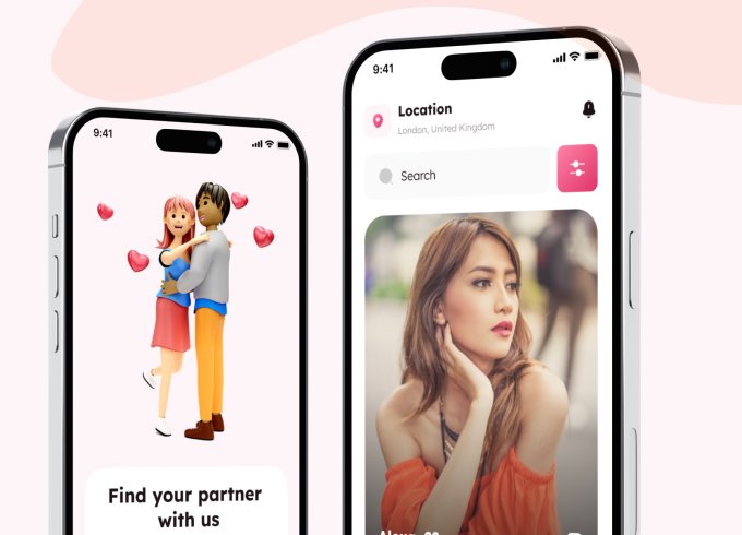
Keeper AI is an advanced matchmaking service to help individuals find ideal partners for casual hookups, long-term relationships, and eventually marriage. It is a new-age dating site for serious relationships that uses artificial intelligence to find and analyze love connections. The platform offers more than just swiping algorithms. The platform uses AI algorithms to find […]
Mobile App Development
Application software is a specialized computer program users utilize on their devices for different purposes. These programs are designed to perform specific user functions, mainly web browsing, word processing, or gaming. For instance, you might use Google Chrome to browse the internet, a spreadsheet application to manage and organize data, or a graphic editing tool […]
Successful Projects
Years in Business
Happy Customers
We have been working with Mtoag Technologies for the past 5 years. They have been a very responsible team from the beginning. They are quick at responding, available whenever we need, and are extremely supportive when there’s a high-priority fix. All-inclusive, IAD can be your best bet for app development.