After getting done with the design system, the most common question every developer goes through is – Which library to choose to style components? As a developer, you may have come across various styled components before. But today, we will talk about the new and the most trending one: Chakra UI.
Before writing this detailed Chakra UI review, we researched a lot about it and were curious to see how it works and if it is worth all the hype. In this review cum guide, we will share our first-hand experience of using Chakra UI after a month. Hopefully, it will be useful for those who are starting with the library.
To help you understand the topic more precisely, we have covered every single point you need to know about Chakra UI, including its features, pricing, usefulness and even its tutorial to get started.
Table of Contents
Toggle- What Is Chakra UI?
- A Look Into Chakra UI Features
- Chakra UI Components for Developers
- Chakra UI Tutorials to Get Started
- Want to Hire Website developers for your Project ?
- What We Liked in Chakra UI?
- Want to Mobile App Development for your Project ?
- What We Disliked About Chakra UI?
- Chakra UI Alternatives You Should Consider in 2023
- Your Success, Our Priority
- Conclusion
- FAQs

What Is Chakra UI?
Chakra UI is a UI library for React applications that is easy to use, modular, and accessible. It has a collection of components that are reliable and can be reused within your React projects.
Chakra UI follows the best practices of functionality and accessibility, making it a smooth and enjoyable experience for both developers and end-users.
It has a variety of components, from basic buttons and input fields to advanced layouts and modals, all with high accessibility standards. If you’re considering using Chakra UI for your next project, first take a look at some of its standout features.
A Look Into Chakra UI Features
As said, Chakra UI stands out for its unique features and functionalities. We were pretty impressed with its features and components. Let’s take a look at some Chakra UI features –
Style Props
Chakra UI is built on a system of styles that can be easily customized and extended with props. This means that you don’t need to use stylesheets or inline styles very often. The UI has many shorthand versions of the style props in its component library. You can find a comprehensive guide to the style props in the official documentation. Some common style props in Chakra Ui include –
- m (Margin)
- mr (Margin right)
- mt (Margin top)
- p (Padding)
- pr (Padding right)
- pt (Padding top)
- py (Padding bottom)
Composition
Chakra UI breaks down components into smaller pieces with fewer properties to reduce complexity and then puts them together to make sure that the styles and functionality are flexible and extensible.

Accessibility
Chakra UI components follow the WAI-ARIA guidelines, which offer keyboard navigation, focus management, correct aria-* attributes, and focus trapping and restoration for modal dialogs. You can see the accessibility report of each component in a file named accessibility.md.
Thematic
Style systems have their own theme specifications. You can change the appearance of your app or download new themes by following these exact theme parameters.
You need to create a theme.js file first, which you need to provide as a JSON object. You can set custom values in the theme object to define the app’s color scheme, font families, font sizes, breakpoints, and more.
Dark Mode
Chakra UI makes it very easy to implement dark mode because it already comes with it. Most of the components in this package work in dark mode. You can use the useColorMode hook in Chakra UI to change the color mode of the app.
Responsive Design
Chakra UI supports mobile-responsive designs that work well on mobile devices. This means that you don’t have to manually add media queries and nested styles to your code. The responsive design supports every style prop in the theme definition. You can also change the style of properties at different breakpoints.
Chakra UI Components for Developers
While reviewing Chakra UI, we were impressed with its variety of components that are high in quality. So, let’s see how Chakra UI components can help designers and developers alike.
Input Components
Chakra UI has input components such as text inputs, select inputs, number inputs, checkboxes, radio buttons, and switch inputs.
Layout Components
Chakra UI lets you create responsive layouts for many components easily. It has layout components like Box and Stack that allow you to adjust your components with properties. You can also use CSS props to pass in attributes like background and justifyContent.
BreadCrumb
You can also use the Breadcrumb component to simplify the navigation between pages. It helps users go back to previous levels of a website, which is very helpful if the website has many pages or products.
Chakra UI has four components related to Breadcrumb: Breadcrumb, BreadcrumbLink, BreadcrumbItem, and BreadcrumbSeparator.
Drawer
Chakra UI Drawer is a unique component. It’s a feature that would fit well in any side navbar. The Drawer component uses Chakra UI’s special useDisclosure hook to control the state of the drawer, which has isOpen, onOpen, and onClose.

Chakra UI Tutorials to Get Started
To get started with implementing the Chakra UI React, follow the below-mentioned steps.
Prerequisites:
- Chakra UI NPM & Node.js
- Chakra React JS
- HTML, CSS, and JavaScript
Step 1: Install Chakra UI
In your project’s root directory, run the following command to install Chakra-ui.
npm install @chakra-ui/core @emotion/core @emotion/styled emotion-theming
Step 2: Create a React App
Now, run the following command to create a new React app.
npx create-react-app foldername
Step 3: Rename the Folder
After creating a folder for the project, now rename it to ‘foldername’ using the following command:
cd foldername
Want to Hire Website developers for your Project ?
Let’s Discuss
→
Step 4: Install Module
After building the ReactJS app, run the following command to install the required module.
npm i @chakra-ui/react @emotion/react@^11 @emotion/styled@^11 framer-motion@^4 react-icons
Step 5: Implement Dark Theme
Now, implement the dark mode using the colorModeScript and useColorMode hook from the Chakra UI.
// Filename – index.js
import {
ChakraProvider,
ColorModeScript,
} from “@chakra-ui/react”;
import React from “react”;
import ReactDOM from “react-dom”;
import App from “./App”;
ReactDOM.render(
<React.StrictMode>
<ChakraProvider>
<ColorModeScript initialColorMode=”light”></ColorModeScript>
<App />
</ChakraProvider>
</React.StrictMode>,
document.getElementById(“root”)
What We Liked in Chakra UI?
After reviewing and deeply analyzing Chakra UI on various aspects, we are ready with our verdict. Here’s what we liked the most in Chakra UI.
- Easy to Use: Chakra UI follows the WAI-ARIA standards, which means that your application will be usable by everyone, regardless of their abilities or disabilities. This is not only a good practice, but also a legal necessity in some places.
- Accessibility: Another we liked about Chakra UI is that it is very flexible and customizable. You can easily adjust its components to match your design vision. You can either use the default styles or create your own unique ones.
- Pre-styled Components: Chakra UI also provides you with a lot of pre-styled components that are ready to use right away. This saves you a lot of time and effort, as you don’t have to build everything from scratch.
- Responsiveness: Finally, Chakra UI is responsive, which means that it adapts to different screen sizes and devices. Your application will look and work great on any device, from smartphones to desktops.
Want to Mobile App Development for your Project ?
Contact Us
→
What We Disliked About Chakra UI?
Chakra UI has many features and components that make it a good option for various projects, but it also has some drawbacks. Knowing these drawbacks can help you decide if Chakra UI suits your project.
Here are some of the challenges you might face:
Some Components Are Impossible to Style
Chakra UI is usually very adaptable when it comes to styling, but some components are not easy to style beyond the default options. For instance, you might discover that some components do not reveal all the CSS properties you want to change, restricting your ability to customize them fully.
No Variants
Chakra UI does provide some theming and customization, but it does not have a variant system for some components. This means you cannot create different styles of the same component and switch between them as you wish. For example, you might need a “primary” and “secondary” variant of a button, but this would need manual styling instead of using a built-in variant system.
Some Components Do Not Support Theming
Some components in Chakra UI do not allow theming, which can be a problem if you want to achieve a certain look and feel. This means you might have to use custom CSS or styled-components to style these specific components, which can be tedious and may cause inconsistencies in your design.
Chakra UI is a strong and flexible library that has a lot of features, but it also has some limitations. These limitations mainly concern customization and theming, which can be important depending on your project’s needs. However, you should know that Chakra UI is a project that is constantly updated, and some of these limitations might be solved in future versions.
Chakra UI Alternatives You Should Consider in 2023
1 Material-UI
Website: https://mui.com/material-ui/
Material-UI (MUI) is a rich UI component library that provides a wide range of UI tools to design and launch new features quickly. It is the top alternative to Chakra UI with over 3.2 million downloads on npm a week, 17k+ followers on Twitter, 78k stars on GitHub, and 2.4k+ open-source contributors. 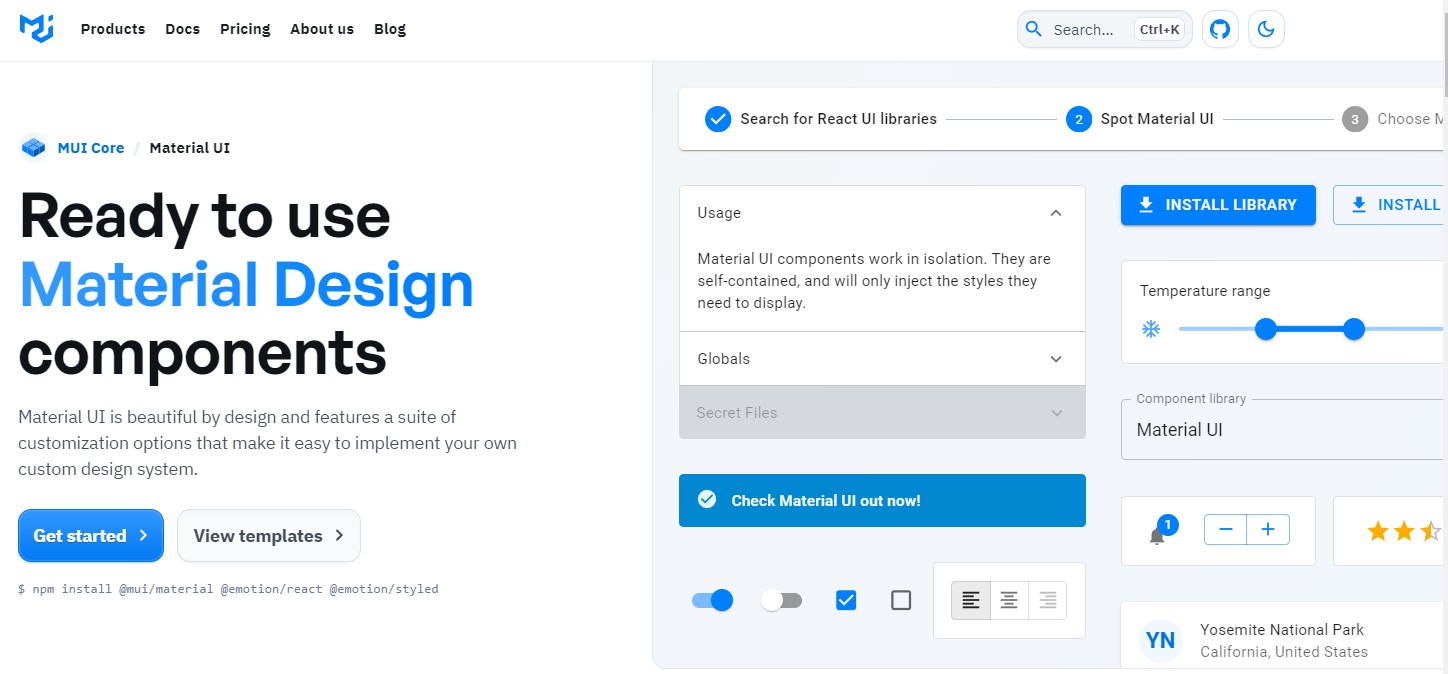
Chakra UI vs Material UI
Criteria
Chakra UI
Material-UI
Popularity
24.5K
74.8K
Customization
High
High
Accessibility
High
High
Components
50+
100+
Pricing
Free; Pro Bundle at $299
Free for core, $249/year for pro
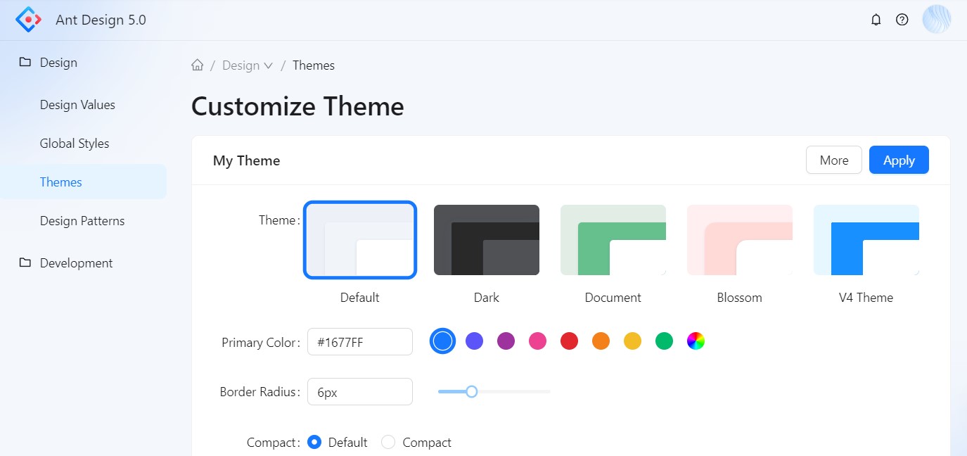
2 Ant Design (AntD)
Website: https://ant.design/
Ant Design is a great choice if you are looking for a react-based UI component library to create high-quality products. It will help you achieve a pleasant and efficient work environment. This tool is used by giants like Baidu, Alibaba, Tencent, and many more. Ant Design provides various UI components to enhance your application and software systems.
Chakra UI vs Ant Design (AntD)
Criteria
Chakra UI
Ant Design (AntD)
Popularity
24.5K
74.4K
Customization
High
Low
Accessibility
High
High
Components
50+
100+
Pricing
Free; Pro Bundle at $299
Free; basic plan starts from $199
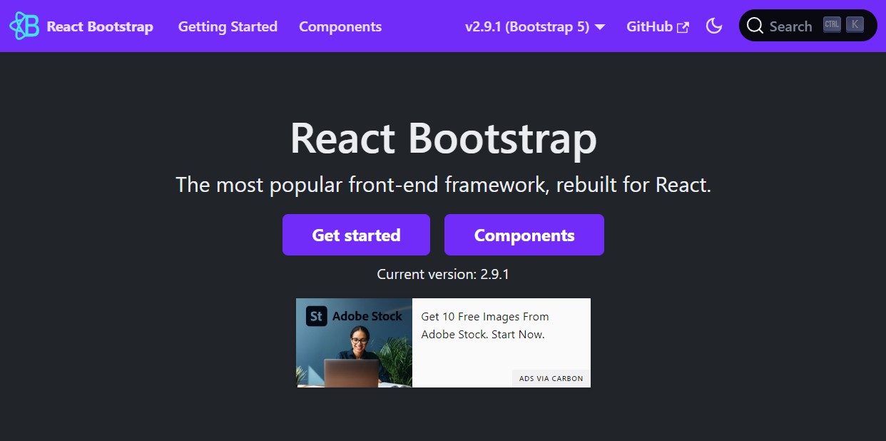
3 React Bootstrap
Website: https://react-bootstrap.netlify.app/
React Bootstrap is a popular front-end framework that is designed for React-based apps and systems. It has eliminated the need for Bootstrap JavaScript, by creating each component from the ground up as native React components that do not rely on any external libraries like jQuery.
React-Bootstrap is one of the oldest React libraries, but it has kept up with the times and become a great choice for creating smooth user interfaces. It offers stunning UI elements for your web and mobile apps, making it the top Chakra UI alternative.
Chakra UI vs React Bootstrap
Criteria
Chakra UI
React Bootstrap
Popularity
24.5K
20.1K
Customization
High
Low
Accessibility
High
Medium
Components
50+
50+
Pricing
Free; Pro Bundle at $299
Free; basic plan starts from $19
4 Blueprint
Website: https://blueprintjs.com/
Blueprint is a UI toolkit based on React that you can use to develop your web apps. It is an open-source project developed by Palantir, a company that specializes in improving user experience by connecting data with applications. If you are working on interfaces that are rich in data and complexity, this tool will fit your needs. It is also mainly used for desktop apps. This component library has more than a thousand stars on GitHub.
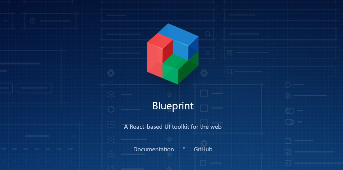
Chakra UI vs Blueprint
Criteria
Chakra UI
Blueprint
Popularity
24.5K
18.9K
Customization
High
Medium
Accessibility
High
Medium
Components
50+
50+
Pricing
Free; Pro Bundle at $299
Free
Your Success, Our Priority
Turn Your Idea Into Reality

Talk to Us
→
5 visx
Website: https://airbnb.io/visx/
visx is a set of low-level, flexible visualization components for React apps, made by Airbnb. It aims to provide a consistent visualization layer across the company, combining the power of D3 for computations with the ease of React for rendering.
visx gives you a seamless experience in any React-based project, as it follows the same conventions and APIs. It also eliminates the need to copy-paste various React hooks for different visualizations.
Chakra UI vs visx
Criteria
Chakra UI
visx
Popularity
24.5K
13.6K
Customization
High
High
Accessibility
High
Low
Components
50+
30+
Pricing
Free; Pro Bundle at $299
Free
6 Fluent
Website: https://developer.microsoft.com/en-us/fluentui#/
Fluent is a versatile, open-source design tool that helps you craft a captivating user interface, making it the best Chakra UI alternative. It was formerly known as Fabric React and is a great UI library made by Microsoft.
Developers and designers can leverage its handy tools to enhance their apps with ready-made design elements, instead of building them from scratch. This tool is smart and user-friendly and adapts to user preferences and actions.

Chakra UI vs Fluent
Criteria
Chakra UI
Fluent
Popularity
24.5K
9.8K
Customization
High
Medium
Accessibility
High
High
Components
50+
100+
Pricing
Free; Pro Bundle at $299
Free; basic plan starts from $19
7 Semantic UI React
Website: https://react.semantic-ui.com/
If you want to use React with Semantic UI, you can create a custom UI component library for your projects. Semantic UI React lets you make your sites and apps with simple and clear HTML. It has got more than 12k stars on GitHub. This tool allows you to choose any CSS theme for your app.
It also uses easy-to-read HTML to make software products. It has a declarative API with strong prop validation and features.
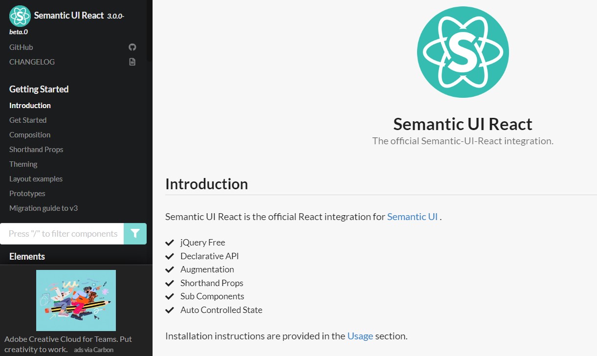
Chakra UI vs Semantic UI React
Criteria
Chakra UI
Semantic UI React
Popularity
24.5K
12.4K
Customization
High
High
Accessibility
High
High
Components
50+
50+
Pricing
Free; Pro Bundle at $299
Free
8 Headless UI
Website: https://headlessui.com/
Headless UI is a Chakra UI alternative that comes from Tailwind Labs. It has accessible and plain UI components that work well with Tailwind CSS. It is one of the top UI libraries for your React projects.
It has over 54.5k stars on GitHub. This tool can keep the app logic and the visual components separate, so it is a great choice if you need a UI for your app. It helps you build apps quickly without leaving your HTML.
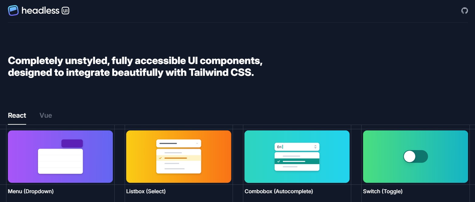
Chakra UI vs Headless UI
Criteria
Chakra UI
Headless UI
Popularity
24.5K
7.6K
Customization
High
High
Accessibility
High
High
Components
50+
20+
Pricing
Free; Pro Bundle at $299
Free
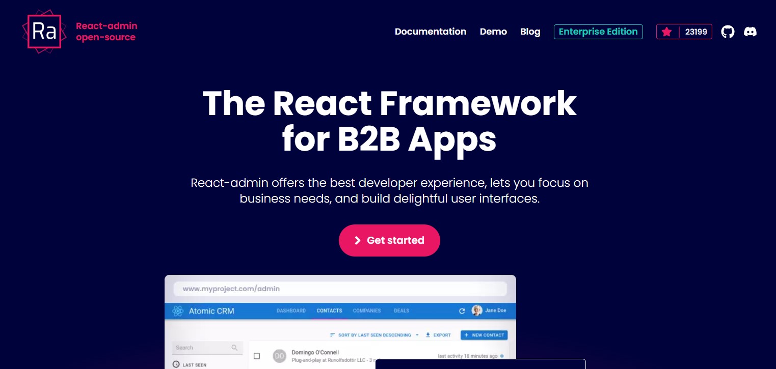
9 React-admin
Website: https://marmelab.com/react-admin/
This is a tool that is open-source, licensed under MIT, and offers reliability, stability, simplicity, and fun. That’s why React-admin has been chosen by over 10k+ companies worldwide for their projects.
With React-admin, you can build amazing UIs, whether for your internal tools, B2B apps, CRMs, or ERPs. It helps developers to design faster and improve their code quality and efficiency.
Chakra UI vs React-admin
Criteria
Chakra UI
React-admin
Popularity
24.5K
11.2K
Customization
High
High
Accessibility
High
High
Components
50+
50+
Pricing
Free; Pro Bundle at $299
Free
10 Retool
Website: https://retool.com/
This is a great choice for building internal applications, as it is a Chakra UI alternative that simplifies the integration of UI libraries, data sources, and access controls. You will have an easy way to manage everything and create apps that users will enjoy. This tool has been adopted by businesses of all scales, from start-ups to Fortune 500s, for making awesome internal applications.
Chakra UI vs React-admin
Criteria
Chakra UI
Retool
Popularity
24.5K
3.5K
Customization
High
Medium
Accessibility
High
Medium
Components
50+
50+
Pricing
Free; Pro Bundle at $299
Free for up to 5 users; paid plans start from $10/user/month
Conclusion
After this detailed Chakra UI review, we can say it is a modern component library for React that provides a set of accessible, reusable, and composable components.
Chakra UI has a large variety of components, excellent documentation, and a supportive community. It is free and open-source, and it has over 10K GitHub stars. All in all, Chakra UI is a great choice for building front-end applications with React, unless you prefer a specific style like Material Design.
Some top alternatives to Chakra UI include Ant Design, Material UI, and Bootstrap. However, Chakra UI stands out for its simplicity, modularity, and accessibility. Therefore, we would recommend Chakra UI to anyone who wants to create beautiful and functional React apps.
FAQs
What Is Chakra UI For?
Chakra UI is a library of React components that are accessible, reusable, and composable. It helps you create beautiful and functional web apps with ease.
Which Is Better MUIOr Chakra UI?
Both MUI and Chakra UI are great options for React UI libraries, but they have different strengths and weaknesses. MUI has more components, features, and reliability, but Chakra UI has simpler and cleaner code, easier customization, and built-in responsiveness and dark mode.
Which Company Uses Chakra UI?
Some companies that use Chakra UI are Blitz.js, Vercel, Auth0, Formidable, and Segment.
Who Invented Chakra UI?
Chakra UI was created by Segun Adebayo, a Nigerian software engineer and UI designer, in 2019.
Is Chakra UI Better Than Bootstrap?
Chakra UI and Bootstrap are different types of UI frameworks. Bootstrap is a CSS framework that provides ready-made styles and layouts, while Chakra UI is a React component library that provides more flexibility and control over the styles and behaviors of the components. Chakra UI is better than Bootstrap if you want a more modern, modular, and accessible UI for your React app.
Is Chakra UI Better Than Tailwind?
Chakra UI and Tailwind are both based on styled-system, which allows you to style components using style props. However, Chakra UI provides more convenience and benefits than Tailwind, such as accessibility, component composition, keyboard navigation, style overrides, and dark mode.