How do you want your mobile app to be designed? Do you want it to be full of features and functionalities, or want to keep it simple? The choice is all yours when it comes to choosing the best mobile app design approach for your app. While many prefer minimalist design concepts, others go with maximalist (complex) designs to develop their app. However, the purpose of both approaches is to offer convenience to the users so that they spend more time on the app, ultimately increasing engagement. So, what would you choose — Minimalist vs Complex Design?
Gone are the days when adding too many elements and using excessive color schemes was normal. However, the time has changed now, and so has user behavior. Today, users appreciate the speed more than anything and are inclining towards minimal interactions. They want everything to be at their fingertips, without the hassle of finding them from the long list of features and menu.
Table of Contents
However, the growing prevalence of minimalist design approaches doesn’t overshadow the demand for complex design in the mobile app development landscape. While both design concepts have their own set of advantages and disadvantages, striking a balance between them would elevate your app towards success. But how would you do that?
Well! Through this blog cum guide, we will compare two of the most effective design concepts, Minimalist vs Complex design, starting from the basics to underscoring the benefits of each and, in the end, helping you decide – which one you should choose in 2025?
Key Statistics Related to the Mobile App Design Industry
But before that, here are some facts and key statistics you should know about the mobile app design industry:
- 94% of first interactions with a mobile app are design-related. (Source: Linearity)
- According to a Google Survey, 76% of users prefer minimalist apps with simple design. (Source: Moldstud)
- 90% of users expect the app loading speed to be less than 3 seconds. (Source: Linearity)
- Investing just $1 in UX design can yield a return on investment (ROI) ranging from $2 to $100. (Source: Truelist)
- It’s worth noting that 13% of customers will share their negative experiences with 15 or more people. (Source: Slideshare)
- Interestingly, around 21% of mobile apps are only used once. (Source: Statistica)
- Aesthetic appeal is the primary reason for 52% of users not returning to a website. (Source: Statistica)
- Poor performance has led 90% of users to abandon an app. (Source: Toptal)
- 57% of users surveyed said they wouldn’t recommend a business with a poorly designed mobile interface. (Source: Socpub)
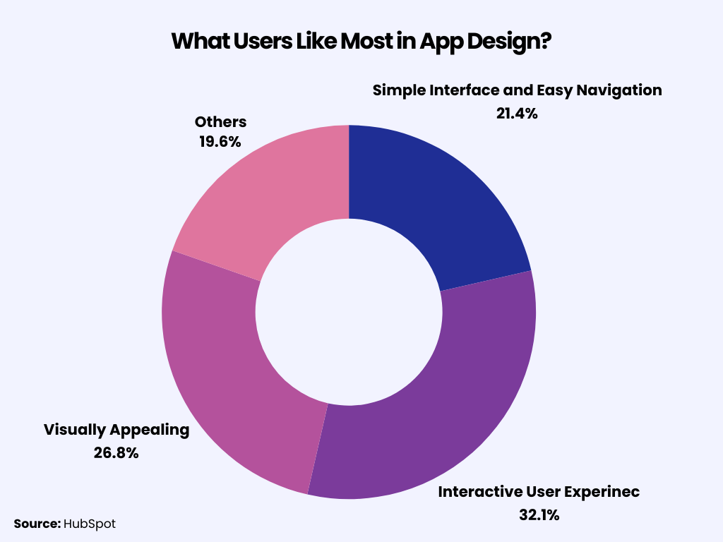
As far as the stats and the current market demand are concerned, minimalist design seems to be the trend of 2024. Let’s move forward to understand these concepts in detail.
Chapter 1: Understanding Minimalist Design Concept
Sometimes, going with the trend isn’t the only way; you should research what your specific group of targeted audience wants. Minimalist design doesn’t mean developing an app with limited features and design elements; instead, it should be designed keeping the user’s convenience in mind. So, before we jump to our conclusion on Minimalist vs complex design, it is imperative to understand the basics of each concept so you would have better decision-making powers.
What Is Minimalist Design?
Minimalism is a design approach that specifically emphasizes simplicity. The concept is based on the principle ‘Less is more,’ which clearly means it distills the mobile app design down to its essential elements only.
The design concept prioritizes eliminating distracting and unused components in the mobile app. A minimalist app usually includes the correct use of white spaces, simple graphic interfaces, and more subdued color palettes and schemes. As a result, the user won’t feel lost and overwhelmed while using your app.
Instead of being flashy and gratuitous, minimalist designs focus on attracting users’ attention with the easy navigation and convenience they offer to the users.
Want to Hire Website developers for your Project ?
Characteristics of Minimalist Design
Here are some characteristics of minimalist design for mobile apps:
- Simplicity: The minimalist design concept focuses on integrating only essential elements, avoiding excessive decoration and color schemes.
- Clean Lines: Minimalist designs often have geometric shapes and straight lines, which gives a sense of clarity.
- Limited Color Palette: Minimalist color palettes generally have limited tones, such as black, white, gray, or beige, to provide a sense of simplicity.
- Negative Space: Using empty spaces is imperative for minimalist design, as it highlights the importance of elements available on the page.
Advantages of Minimalist Design in the Mobile App Design Process
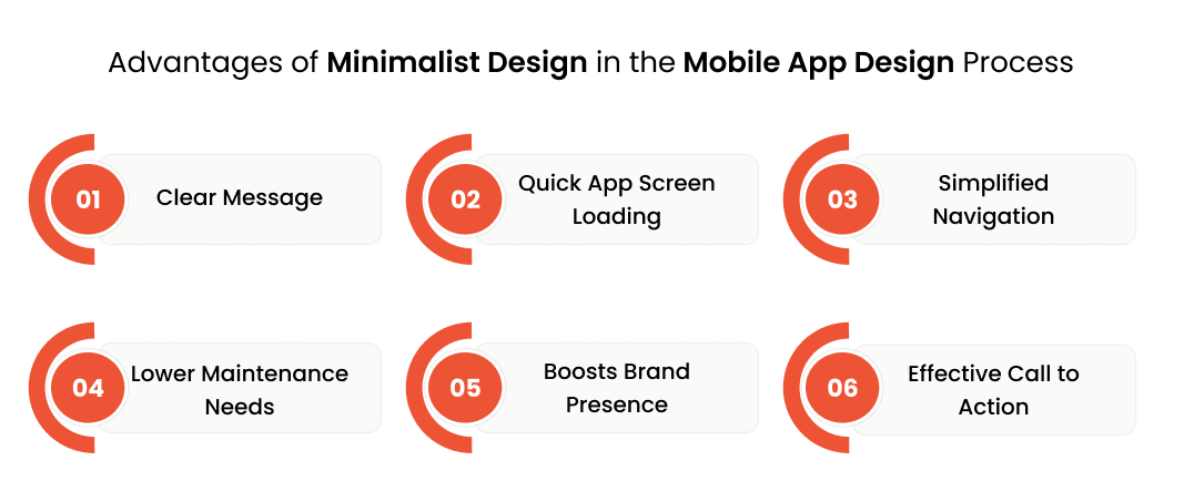
As one of the trendiest things in the mobile app design industry, embracing a minimalist design approach comes with plenty of advantages, including
Clear Message
Adding too many elements on a screen can confuse users and obscure the main message you want to convey. However, incorporating minimalism into your mobile app interface ensures that users can easily grasp your intended message.
Quick App Screen Loading
When you remove unnecessary components, your app becomes faster. This not only reduces the chances of app crashes but also enhances the user experience, leading to longer usage times on consumer devices.
Simplified Navigation
One of the reasons minimalist mobile app design is becoming popular is its ability to improve app navigation. With fewer elements on a screen, users are less likely to be distracted and find an alternate navigation path.
Want to Mobile App Development for your Project ?
Lower Maintenance Needs
The time, effort, and cost of app maintenance are directly related to the number of elements on the screen. Therefore, minimalist UX design can reduce these requirements.
Boosts Brand Presence
A minimalist app design can help brands increase their app’s appeal. The design concept encourages users to stay on the interface longer, continually gaining their interest.
Effective Call to Action
The clarity and simplicity of the interface allow you to direct the user’s attention to what you really want them to see. Whether you want your users to use your app for a specific purpose or subscribe to your top video, your call to action will stand out beautifully on the app.
After understanding the benefits of using a minimal UI design, we are sure you’ll be eager to start implementing it in your app design.
Elements of Minimalist Design to Watch For in the Mobile App Development Process
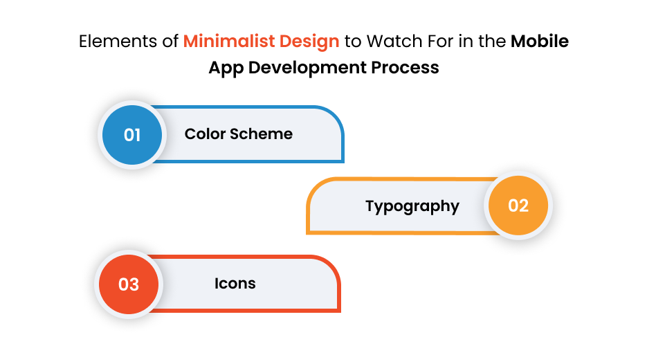
The elements of minimalist design make it a popular choice not just for developers but also for users. Understanding which element to use and to what extent is crucial to captivate a large user base. So, here are some minimalist app design elements to consider in mobile app development:
Color Scheme
The color scheme remains the most primitive element when it comes to choosing a minimalist design for your mobile app. The type and the intensity of color you choose for your app’s interface have a major impact on your targeted audience. If your app is overwhelmed with bold and too many colors, it is likely to be abandoned by the user. Instead, you should use calm colors that align with your app’s design.
Typography
Typography is another element that influences the app’s design. The more interactive your written content is, the higher the chance of interaction between your users and the app interface.
If you choose the typography wisely, it can help attract more and more visitors to your app. However, if it is disorganized, it may offer a negative feel to the user, especially when your app has multiple typography errors or fonts.
Icons
Icons are the most critical element of a mobile app that addresses the content and functionality. A simple visual icon is easy to get noticed. You can even highlight the icon to indicate which action is active.
Chapter 2: Understanding Complex (Maximalist) Design Concept
Now that you have understood the concept of minimalist apps and the benefits associated with it, let’s move forward to the next section – understanding complex app design concepts.
What Is Maximalist App Design?
Maximalism is another mobile app design approach that works in contrast to the minimalist design. The design approach focuses on using striking color schemes, typefaces, and UI components to capture the user’s attention.
While maximalist design prioritizes grabbing the user’s attention through designs, minimalist apps are more focused on providing convenience. By combining a variety of styles, color schemes, and elements, maximalist designs add a wow factor to your mobile app.
The ultimate aim of maximalist apps lies in creating a unique, visually appealing mobile app interface that stands out from the competition. Overall, maximalism is quirky, entertaining, and unique but not alluring and subdued.
Characteristics of Maximalist App Design
Here are some characteristics of maximalist design for mobile apps:
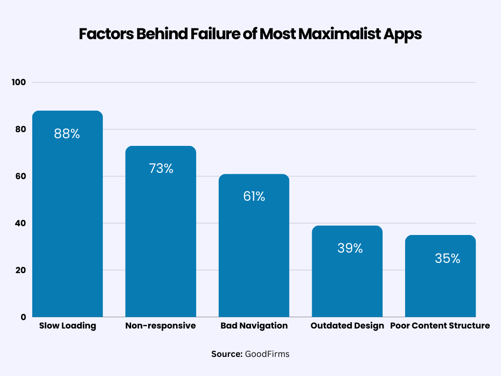
- Abundance: Maximalism focuses on the excessive use of multiple color palettes, patterns, and textures in designs.
- Layering: The maximalist app often layers up many elements, including mixing patterns and creating visually rich and dynamic spaces.
- Bold Colors: Maximalism is all about using bold and vibrant colors to make a one-of-a-kind impression.
Advantages of Complex App Design
While minimalist apps offer a long list of benefits, you should remember it’s not the only option available. Maximalist designs also have several advantages for businesses and users alike.
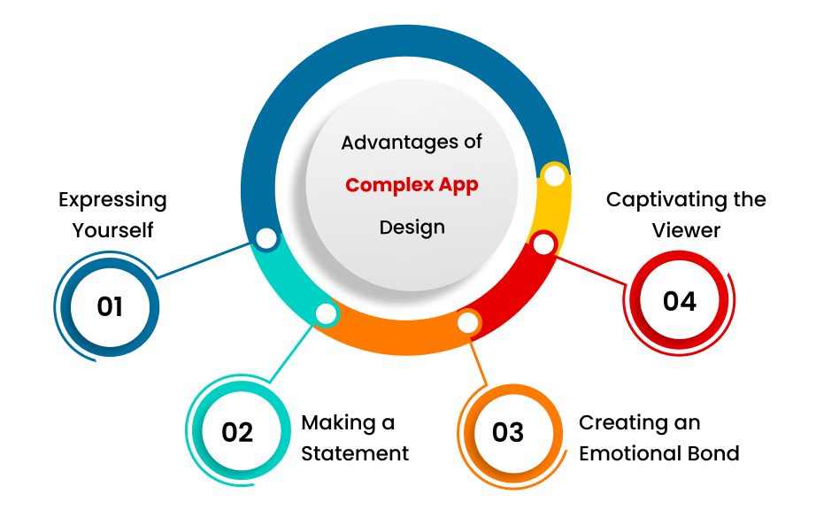
Expressing Yourself
Maximalist designs are a fantastic way for both designers and users to express their unique personalities. They can do this through a wide variety of colors, patterns, and textures.
Making a Statement
Maximalist designs inspire designers to be bold and confident in their choices. This allows them to create spaces that not only make a strong statement but also leave a lasting impression.
Creating an Emotional Bond
The intricate nature of maximalist designs can stir up powerful emotions and resonate with viewers on a more profound level. This can foster a sense of connection and engagement, which can be particularly beneficial for brands promoting their products or services through SaaS influencer marketing campaigns.
Captivating the Viewer
Maximalist designs provide a visually engaging experience with their abundance of colors, patterns, and textures. This creates layers of visual interest that captivate the viewer’s attention.
Elements to Consider in Maximalist App Design
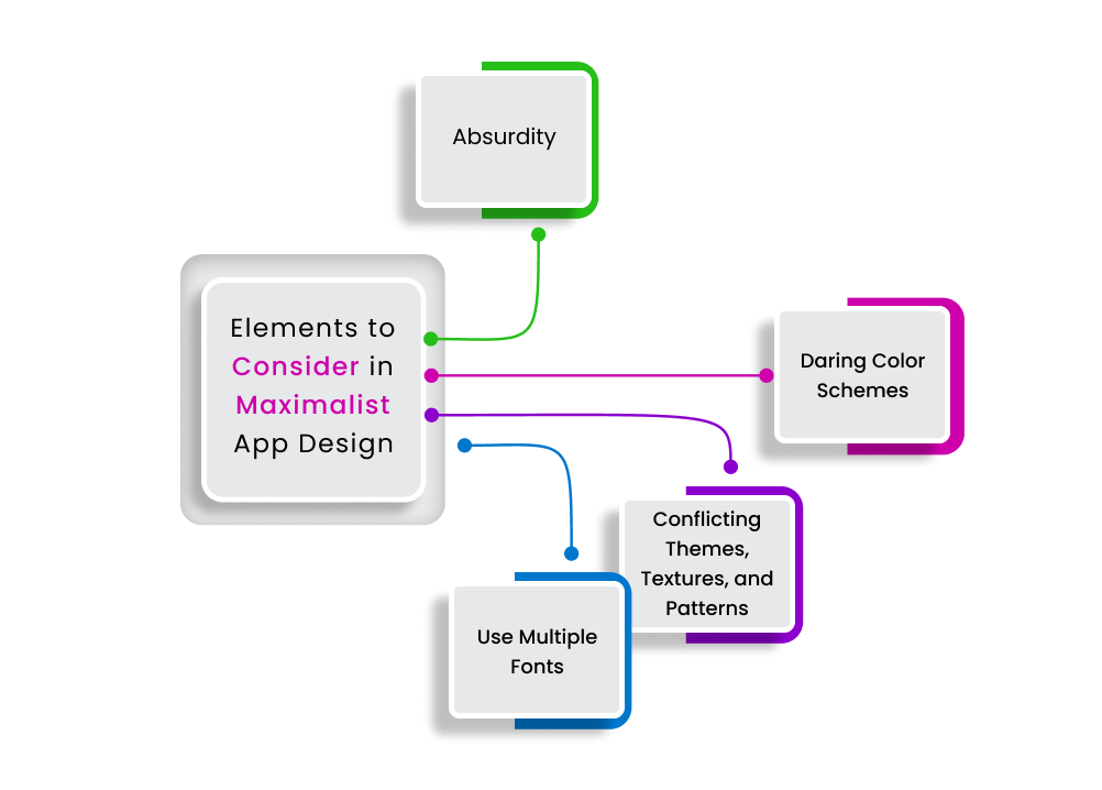
Maximalist design elements are quite different from that of minimalist apps. These elements are focused on increasing the app’s visual appearance. Here are some key elements of maximalist apps:
Absurdity
The maximalist app is usually overwhelmed by quirky illustrations, annoying emojis, meta jokes, pointless animations, Easter eggs, pop culture references, and other not-so-important elements. However, these design elements work wonders for app owners by keeping the users engaged for a longer period.
Daring Color Schemes
As said earlier, maximalist design often uses abstract color and saturation and literally breaks every rule of color theory in the design principles.
Conflicting Themes, Textures, and Patterns
While minimalism focuses on delivering convenience and uniformity, maximalist apps are inclined towards making the app visually appealing. The design approach uses opposing patterns and irregular textures.
Use Multiple Fonts
Maximalist designs involve using multiple fonts on a single page. The use of multiple typefaces may confuse users, ultimately leading them to uninstall the app.
Ready to bring your B2B portal or app idea to life?
Chapter 3: Detailed Comparison Between Minimalist vs Complex Design
The debate between minimalist and maximalist design principles has reached intense levels, with new technologies influencing mobile app designs. As said earlier, both principles aim to attract new users and keep them engaged for a longer period of time.
Maximalist mobile apps have long dominated the design industry, and for good reasons. Their excessive use of elements and diverse color schemes increase user engagement. However, the times have changed now, with minimalist designs gaining immense popularity among designers and users alike.
Minimalist designs not only look great on small screens, but on large screens too. Additionally, they are easy to operate and navigate, which encourages users to spend more time on your app. That’s the reason why many news sites and blog websites use minimal design elements, such as neutral colors, white spaces, and clean typography, to entice users to stay engaged.
Now that you have understood the basics of minimalist and complex designs, let’s take a closer look at the key differences between these two of the most popular design philosophies. Here’s a quick comparison table underscoring the advantages and disadvantages of these concepts:
|
Design Philosophy |
Advantages |
Disadvantages |
|
Minimalist |
|
|
|
Complex |
|
|
Minimalist vs Complex Design: Which One Should You Choose?
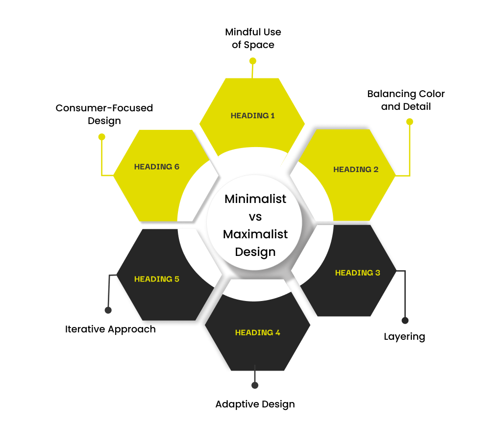
Deciding between minimalism vs complex design in mobile app design is a more complex situation. Rather than seeing them as two different concepts, businesses should consider them as a single strategy in a well-rounded design toolbox.
Here are six tips to help strike the right balance:
Mindful Use of Space
A strategic combination of both design philosophies can be achieved by correctly using the blank spaces. For example, a business might opt for a minimalist design for its homepage, featuring clean lines and plenty of white space, while incorporating maximalist elements such as detailed illustrations or bold fonts to highlight important sections.
Balancing Color and Detail
Businesses can combine the calm of minimalist color schemes with the energy of maximalism. A subdued background might be enlivened with bursts of complex patterns or bright colors in certain areas, creating an engaging but not overpowering balance.
Layering
Use layering to transition between the two design philosophies seamlessly. This could involve a basic, clean primary design layer with options for the viewer to explore further, uncovering more detailed and rich content, much like the unseen depths of an iceberg.
Adaptive Design
With the variety of platforms and mediums brands use today, an adaptive design approach is crucial. A brand might choose a minimalist design for its mobile app for user-friendliness, while its print media or physical spaces, like stores, might indulge in maximalist grandeur to provide a tactile and immersive experience.
Iterative Approach
Design isn’t static. It changes as brands evolve and audiences shift. Brands should be open to revising their designs, starting with a minimalist approach and gradually adding maximalist elements based on audience feedback or the other way around.
Consumer-Focused Design
Above all, the design should always prioritize the consumer experience. By conducting user testing and collecting feedback, brands can determine which mix of minimalism and maximalism best resonates with their target audience. The goal is to create a journey that is intuitive, engaging, and memorable for the consumer.
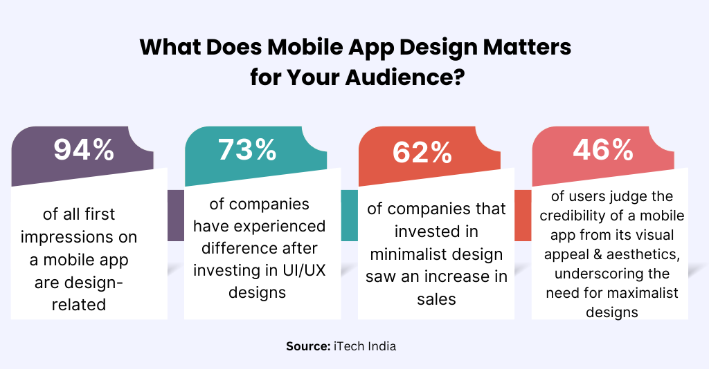
Remember, combining minimalism and maximalism isn’t about making compromises; it’s about enhancing the overall effect. By selecting the best aspects of both worlds, businesses can craft a multi-dimensional design narrative that stands out in a competitive market.
This process requires skill, a deep understanding of the brand’s identity, and a willingness to experiment. But when done with precision, the outcome can be truly transformative.
Conclusion
Striking the balance in mobile app design is something that can catapult your app’s success. It’s not just about picking minimalism or maximalism but learning how to combine different elements to produce a unified and effective result. This balance is particularly important if you’re aiming to create designs that connect with your audience.
Still unsure about the best mobile app design strategy for your brand? We understand. We also know that finding the right balance can be challenging. That’s why we’re offering FREE consultations. Just schedule an appointment with Mtoag Technologies to discuss the possibilities.
FAQs
Why Minimalist Design is Better?
The minimalist design concept focuses on integrating only essential elements, avoiding excessive decoration and color schemes.
What is Minimalism in Design?
Minimalism in design is a concept that prioritizes integrating only the essential elements so that users get the utmost convenience.
What is the Disadvantage of Minimalist Design?
The two potential disadvantages of minimalist designs include a lack of depth and the risk of blandness.
What is Minimalist vs. Modern Style?
While minimalist styles are more focused on integrating only essential design elements in an app, modern styles incorporate all the contemporary features.
