2500+
Successful Projects

The use of responsive web design has become standard practice in the modern digital environment. Because people have access to such a wide variety of devices and screen sizes, websites must be responsive to many platforms. Websites that are responsively designed look and perform at their best, offering a consistent user experience on all platforms.
In this piece, we will examine the foundations and advantages of responsive web design. We will explore the importance of putting mobile first, the benefits it provides over having distinct desktop and mobile versions (for example, having a separate mobile site with a different URL), and how user behavior differs across devices. We will also discuss typical implementation issues for responsive design and the significance of testing and optimization.
Table of Contents
Come along as we explore responsive web design and see how it improves user experience, accessibility, and success in today's multi-device world.

An approach to web development known as responsive web design seeks to build websites that can easily adjust to various screen sizes and devices. The guiding concepts of responsive design are content prioritization, fluidity (the ability of elements to resize and reposition themselves based on the screen size), and adaptability.
Fluid grids and adaptable layouts are used in responsive design to enable components of a webpage to change size and position in response to the screen size of the device being used. This guarantees a proportionate adjustment of the design elements and information, resulting in the best viewing experience.
One essential element of responsive design is media queries. They let developers use various layout guidelines and styles according to the device's specs, including screen size, resolution, and orientation. By targeting certain styles using CSS media queries, a customized experience for every device may be achieved.

Using responsive design means prioritizing content when organizing and presenting it on various devices. This guarantees customers access to the most important information without being overloaded with extraneous details. Deliberate design choices like changing font sizes, omitting unnecessary features, and rearrangement of content blocks may prioritize material.
One of the fundamental tenets of responsive web design is the mobile-first strategy, which emphasizes the significance of developing first for mobile devices and then gradually improving the experience for more extensive displays. The strategy acknowledges the growing prevalence of mobile devices as well as the particular difficulties they provide.
The number of people using mobile devices to access websites is rising quickly. According to statistics, more people use smartphones and tablets than desktop computers to access websites. Mobile devices also make up a large amount of internet traffic. By focusing on mobile design, websites may enhance user experience and cater to the expanding mobile audience.

Mobile consumers have high standards for a smooth and intuitive experience on their devices. They anticipate that websites will load quickly, have easy-to-use navigation, and present material in a legible manner. Using a mobile-first strategy, designers may prioritize the most important features and content for mobile users.
The most widely used search engine, Google, has switched to a mobile-first indexing strategy, which means that a website's mobile version is given priority when it comes to indexing and ranking. By adhering to Google's indexing preferences, a mobile-first design optimizes the user experience and boosts search engine optimization (SEO).
With responsive design, a consistent brand experience and interface across many devices are guaranteed. Regardless of the device being used, users can easily identify and explore a website. Consistency in this regard promotes familiarity and trust, which improves user engagement and conversion rates.
Responsive design is a time and money saver. Creating and updating different websites for desktop and mobile devices can be a costly and time-consuming endeavor. With responsive design, one codebase can adapt to several screen sizes, reducing total expenses, minimizing maintenance tasks, and saving development time. This efficiency can provide a sense of relief to web developers and business owners.
By adjusting the content layout, font sizes, and navigation to each device's screen size and capabilities, responsive design maximizes the user experience. Higher satisfaction and engagement result from users' ease of access to information, comfort while reading material, and intuitive interaction.

A flexible website reduces the possibility of content duplication penalties from search engines by eliminating the necessity of duplicating material across several versions. Furthermore, a flexible design offers a unified URL structure that combines SEO ranking indications and authority. Consequently, responsive websites often rank higher in search engine results.
Responsive design is an investment for the future. As technology continues to evolve, new gadgets with varied screen sizes and capabilities will emerge. Websites that use responsive design are future-proof because they can adapt to new devices without the need for a complete overhaul. This readiness and scalability can provide a sense of security and preparedness for the changing digital environment.
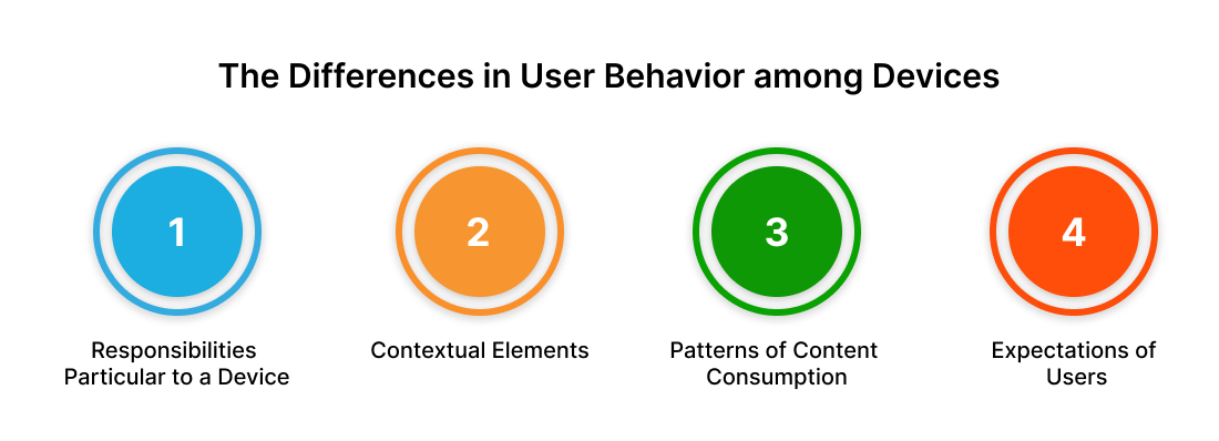
Understanding user behavior is crucial for providing customized experiences. The devices users choose significantly influence their behavior, and it's essential to comprehend these differences. This understanding can enlighten web developers, designers, and business owners about the need for tailored experiences.

While transferring between devices, users anticipate consistent and smooth transitions. Customers want responsive websites that adjust to the screen size and specification of the device they have selected.
Designing with mobile users' requirements and limitations in mind from the start is known as the "mobile-first" approach. The following are the advantages of having a mobile-first mentality:
Starting with mobile devices forces designers to focus on the most essential features and information, making for simplified and succinct user experiences.
Compared to desktop users, mobile device users often have shorter attention spans and distinct objectives. Creating mobile-first content ensures that the main point is conveyed clearly.

Mobile devices usually have slower internet connections and less computing capacity than desktop computers.
It is prioritizing mobile optimization, resulting in lighter, quicker websites that benefit consumers on all platforms.
Developing from the ground up with a mobile design enables a base that can be improved with further features and layout modifications for more extensive displays.
This method guarantees a smooth transition and offers the best possible experience on every device.
Complex layouts and navigation menus may be difficult to handle with responsive design. To overcome these obstacles, consider the following solutions:
Use off-canvas menus, collapsible menus, or hamburger symbols to make navigation menus more manageable on smaller displays. Give priority to crucial navigation links and contemplate using sticky menus or breadcrumb navigation for enhanced accessibility.
Divide intricate designs into separate parts that can be stacked vertically on smaller displays and moved around. Use CSS grid or flexbox to design flexible and adaptable layouts that adapt to multiple screen sizes without compromising visual appeal.
Use progressive disclosure strategies to optimize the presentation of complicated information on smaller displays. By revealing or hiding material in response to user activities, you can keep the initial layout simple. Similarly, you can use accordions, tabs, or expandable sections to enable users to disclose more material as required.
In the age of many devices, responsive web design is essential. It improves the user experience and accessibility by adjusting to various devices and screen sizes. It prioritizes fluidity, adaptability, and content optimization.
In this post, we examined the advantages of responsive design versus distinct versions, user behavior across devices, and a mobile-first strategy. We also discussed testing, optimization, and overcoming obstacles.
Businesses can provide consistent experiences and adjust to the changing digital world with the help of responsive web design.
To sum up, responsive design is an effective tool for creating user-centered websites and achieving long-term success online.
Are you prepared to unleash responsive web design's potential? Please contact us to begin developing mobile-friendly, user-friendly websites right now and transform your online presence!